
Helping Hands:
Part II
Sunday 27th September 2015
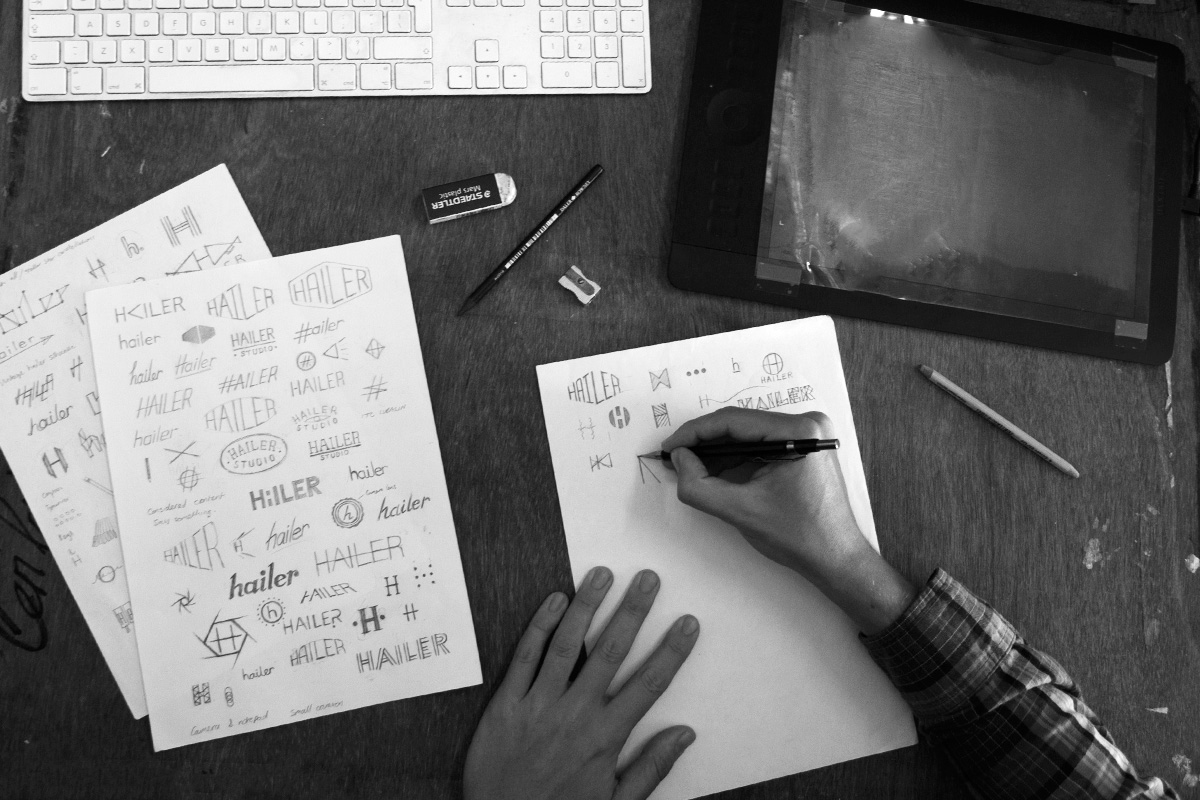
What’s the good of a logo and visual identity if you’re not marketing yourself widely and trying to “shift units” (to customers rather than clients)? Surely, a logo only really becomes a “brand” when it holds some meaning to the viewer? Most companies do require a visual identity though (whatever it is that they’re “selling”) to accompany their name, aesthetic, tone of voice, and everything else that makes up their brand – the brand being the image that the company conjures up in people’s imaginations and the way that it is perceived. Even if, like Hailer, your company works behind the scenes building other companies brands you still require a mark to sit at the top of your website or in the profile image on your social media platforms. Many companies that operate in this sort of capacity don’t pay too much attention to this (the excuse being that few people ever see it), at their peril. When Mat Arney founded Hailer he needed a subtle yet stylish graphic mark that would sit seamlessly alongside the brand identities of the company’s various (existing) clients and that wouldn’t risk pigeon-holing the growing company. As the aesthetic and tone of voice of Hailer was already established due to Mat’s previous personal and professional work, designing a logo to fit the brief wasn’t an enviable task. Ceri Pashley, Creative Director of El Carousel was the man for that task. Ceri and Mat lived together at University, have worked and travelled together in the past and now live less than fifteen miles apart on opposite coasts of the Cornish peninsula, so even though Ceri now works predominantly in the realm of motion graphics and digital animation for large agencies and multinationals, he had little defense against Mat’s insistence that he was the best designer that he knew and the only person that he’d have develop Hailer’s mark and identity.
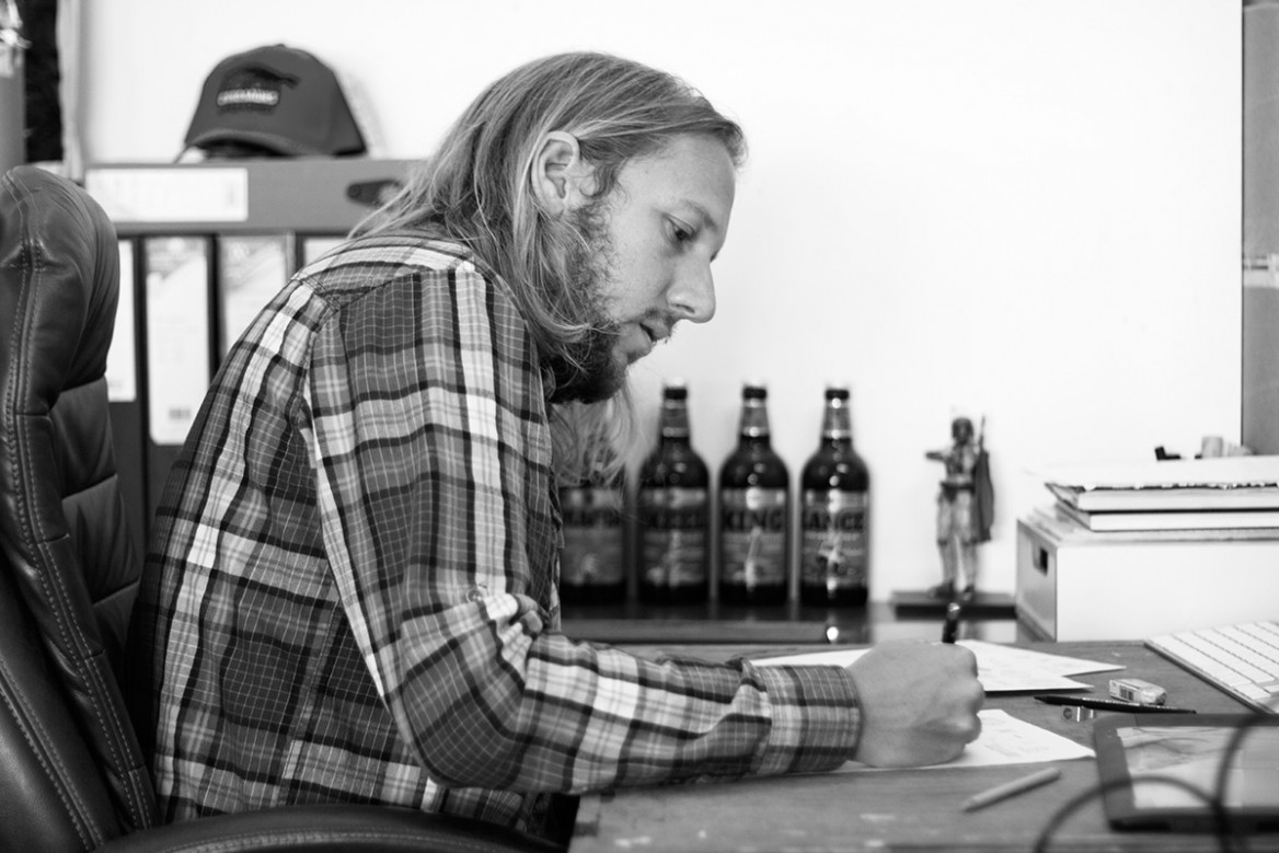
Ceri’s front door is 5 metres from the door of his local pub, and about 8 metres from the waters edge in the beautiful village of Flushing, so after-work design meetings between the two of them followed bedtime stories for Ceri’s two young boys and were usually conducted over a pint of beer. Ceri took Mat’s brief for a monochromatic text-based mark that would transcend fashions and trends, and generated a raft of initial design ideas based upon his familiarity with Mat’s photographic style, knowing that that would be the primary base for Hailer’s visual identity. Any one of the final set of five brand marks that he presented for consideration would have been perfect, and so selecting the most appropriate one was an unenviable task. In the end, Ceri’s clean and stylish rendering of the Hailer name in a hand-drawn font sitting within a bounding box won out for its wide appeal and beautiful simplicity. Over the course of several weeks following the delivery of the final logo, primary and secondary colour ways and fonts were tested and selected and Hailer’s broader brand identity was cemented into what you see before you now. We don’t think it’s bad for a guy who claims to not do very much logo design work any more; Ceri’s clearly still got his eye in and we’re grateful that he came out of “branding retirement” to help us bring Hailer’s visual identity to life.